We gave community profiles a full makeover!
You worked hard for every one of those badges and they deserved better than a long jumble on a grey page. So now they live in a proper trophy case.
What's new
A note on favorite workouts
Some older favorites were typed in by hand and never pointed to a real workout. We fixed the ones we could and quietly hid the rest. If one of yours went missing you can pick it again in Edit Profile with the workout picker.
It took a few hours and one very picky server to get this live and we're quite proud of it.
Could you take a peek at your own profile? If a badge is missing you can add it with the Edit badges link in your trophy case. And if anything looks odd on your screen we'd love to hear about it below. Thank you
What's new
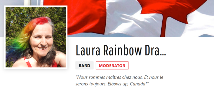
- Your banner runs across the top with a bigger avatar next to your name.
- A stats strip shows how many programs and challenges you have completed and your badge total (every single one counts).
- Achievements, programs, challenges and special event badges each get their own shelf. Long shelves fold up with a Show all button so nobody has to scroll forever on a phone.
- Your favorite workouts show with their posters.
- Your Guild Rank and your About details sit in their own cards on the side.
- All of it works on phones too.
A note on favorite workouts
Some older favorites were typed in by hand and never pointed to a real workout. We fixed the ones we could and quietly hid the rest. If one of yours went missing you can pick it again in Edit Profile with the workout picker.
It took a few hours and one very picky server to get this live and we're quite proud of it.
Could you take a peek at your own profile? If a badge is missing you can add it with the Edit badges link in your trophy case. And if anything looks odd on your screen we'd love to hear about it below. Thank you