New Footer, Who Dis?
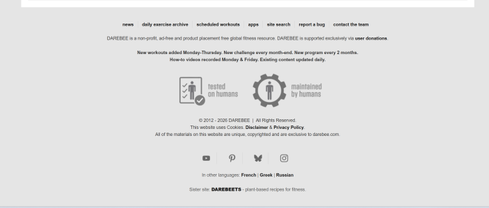
We've given the site footer a much-needed facelift! The old footer had served us well since forever, but it was starting to feel a bit cramped - everything stacked in one long column with the links squeezed into a single row up top.
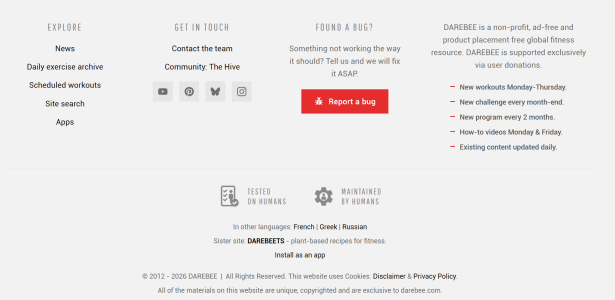
The new footer is organized into four clean sections:
Explore - quick links to News, the Daily Exercise Archive, Scheduled Workouts, Site Search, and Apps, all in one place.
Get in Touch - contact the team, jump into The Hive, or find us on social media.
Found a Bug? - spotted something broken? There's now a big red "Report a bug" button you can't miss. Tell us and we'll fix it ASAP.
About DAREBEE - what we are, how we're supported, and our content schedule at a glance (new workouts Monday-Thursday, new challenge every month-end, new program every 2 months, and more).
Everything you're used to is still there - languages, DAREBEETS, the app install link, and of course "tested on humans, maintained by humans"- it's just easier to find now.
Screenshots attached: before (the old single-column layout) and after (the new four-column design). Let us know what you think, and if anything looks off on your device, you know where the red button is
Before:
After:
The new footer is organized into four clean sections:
Explore - quick links to News, the Daily Exercise Archive, Scheduled Workouts, Site Search, and Apps, all in one place.
Get in Touch - contact the team, jump into The Hive, or find us on social media.
Found a Bug? - spotted something broken? There's now a big red "Report a bug" button you can't miss. Tell us and we'll fix it ASAP.
About DAREBEE - what we are, how we're supported, and our content schedule at a glance (new workouts Monday-Thursday, new challenge every month-end, new program every 2 months, and more).
Everything you're used to is still there - languages, DAREBEETS, the app install link, and of course "tested on humans, maintained by humans"- it's just easier to find now.
Screenshots attached: before (the old single-column layout) and after (the new four-column design). Let us know what you think, and if anything looks off on your device, you know where the red button is
Before:
After:

 from
from